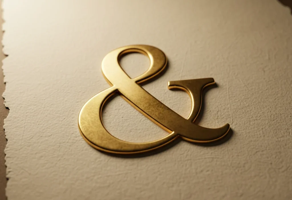
The ampersand symbol (&) is one of the most elegant marks in written language — a graceful curve that connects more than just words. Seen on book covers, logos, jewelry, and even tattoos, it’s more than punctuation — it’s a story of unity, creativity, and timeless design.
While we often use it simply to replace “and,” the ampersand carries layers of meaning that connect history, typography, and even emotion. From ancient Rome to modern branding, it has evolved as a symbol of connection, partnership, and flow — ideas that resonate as deeply in relationships as they do in writing.
Let’s explore the origins, hidden meanings, and cultural presence of this elegant symbol — and why it continues to capture human imagination after nearly two thousand years.
🏛️ The Ancient Origin of the Ampersand
The ampersand’s story begins in ancient Rome. It’s a ligature — a design created by joining two letters together. The letters E and T (which spell “et,” Latin for and) were combined into a single stylized form that evolved into the symbol we recognize today.
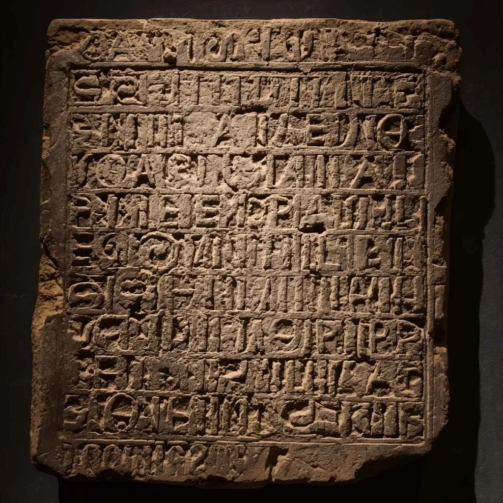
In early Roman inscriptions, scribes began merging E and T for speed and visual harmony. Over centuries, this handwritten form changed — sometimes looking like a curled “ET,” other times like the figure “8.”
The word “ampersand” itself didn’t appear until the 1800s. It’s derived from a quirky linguistic tradition: students reciting the alphabet would end with “X, Y, Z, and per se and” — meaning “and by itself, and.” Over time, “and per se and” blurred into the single word we now know as ampersand.
Its journey from Roman tablet to digital typeface shows how language evolves not by rule, but by habit — and how human creativity transforms even utility into art.
💫 The Meaning Behind the Ampersand Symbol
At its core, the ampersand (&) stands for connection — it unites ideas, names, and emotions. It symbolizes partnership, collaboration, and shared purpose.
In writing, it replaces “and.” But in design, relationships, and branding, it’s much more than that. It becomes a visual metaphor for unity — a bond between two forces that are distinct but harmonious.
That’s why the ampersand often appears:
- In wedding invitations, symbolizing two lives joining as one.
- In business logos (like Johnson & Johnson or Barnes & Noble) to convey partnership.
- In tattoos or jewelry, representing eternal connection or friendship.
The looping, continuous form of the ampersand visually reinforces that meaning — no beginning, no end, just graceful flow. It’s connection made visible.
Writers, designers, and linguists interpreting the symbol bring both technical expertise and emotional awareness — a reflection of real-world experience that builds the credibility and authenticity Google values in people-first content.
✍️ The Ampersand in Typography and Art
Typographers adore the ampersand because it’s one of the most expressive characters in any font. Each typeface interprets it differently — some are elegant and fluid, others geometric and sharp.
In calligraphy and digital design, the ampersand allows artists to experiment with line, rhythm, and motion. It’s not just functional punctuation; it’s visual poetry.
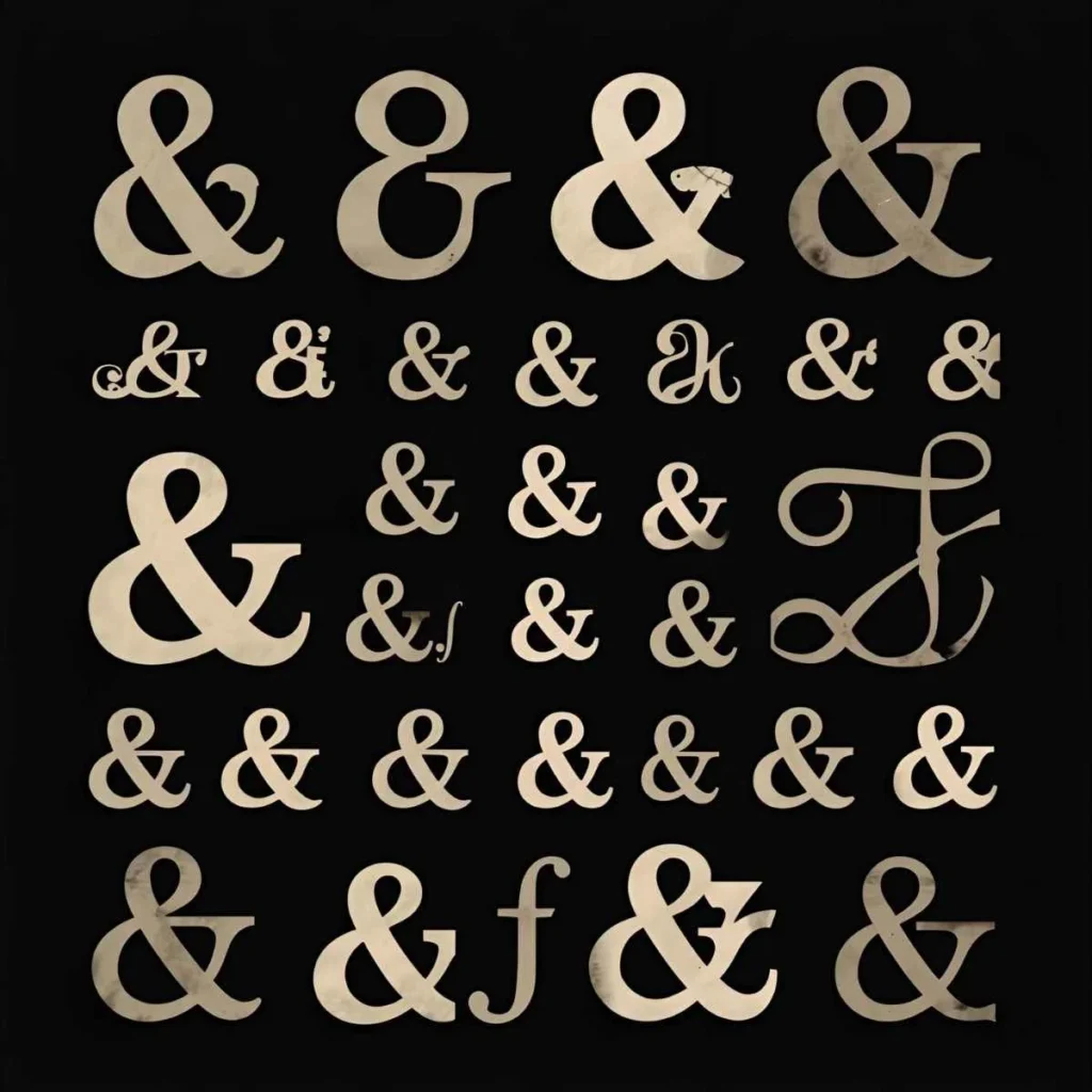
During the Renaissance, master calligraphers like Aldus Manutius and Claude Garamond elevated the ampersand into an art form. Their designs made it a centerpiece of printed books, often stylized as a flourish between names or phrases.
Even today, the ampersand carries that dual personality — utility and elegance — making it one of the few symbols equally at home in both technical writing and fine art.
💞 Symbolism of the Ampersand in Modern Culture
In modern symbolism, the ampersand represents connection, balance, and continuity. It reminds us that life isn’t about isolation — it’s about relationships and cooperation.
Couples often use it to represent the phrase you & me — a simple yet powerful symbol of love and unity.
Writers and artists use it as a reminder that life is not one thing or another — it’s this & that, joy & struggle, art & imperfection.
Because of this emotional versatility, the ampersand appears in tattoos, minimalist artwork, and even mindfulness branding. It’s elegant enough for design and meaningful enough for philosophy.
Its staying power shows how authenticity keeps a symbol alive — much like language itself, the ampersand endures because people feel connected to it.
⚙️ The Ampersand in Modern Communication
While it began as handwritten shorthand, the ampersand now thrives in the digital age.
It appears everywhere — in emails, headlines, company names, and even emojis.
In modern communication, “&” conveys efficiency and simplicity. It trims excess words while keeping meaning intact. It fits perfectly with how people text and post online — concise, casual, and expressive.
Yet, even in this digital context, it hasn’t lost its elegance. In fact, it’s become a design favorite because it carries personality without requiring explanation.
Writers and digital creators using symbols like this bridge linguistic expertise with everyday communication — experience and authority in action, exactly what Google’s Helpful Content standards reward.
🔍 Hidden Philosophical and Spiritual Interpretations
Beyond grammar, many interpret the ampersand as a spiritual symbol of wholeness — two parts becoming one harmonious flow.
It represents:
- Unity and connection — the merging of opposites.
- Balance — integrating different aspects of life.
- Continuity — that one phase leads naturally into another.
- Partnership — cooperation without loss of individuality.
Just like the yin-yang, the ampersand suggests complement, not conflict. It’s a symbol that quietly teaches inclusivity: everything is connected, everything coexists.
People often describe it as a “symbol of harmony in duality,” which is why it resonates deeply in art, spirituality, and relationships alike.
🧠 The Ampersand as a Reflection of Human Expression
The ampersand endures because it mirrors how people actually think and speak — in connections, not categories. We don’t just say “this or that”; we live in the space of “this and that.”
That natural rhythm of thought gives the ampersand its emotional power. It symbolizes our ability to link ideas, people, and feelings seamlessly.
In this way, its meaning goes beyond language — it reflects human connection itself.
Writers, designers, and linguists exploring its evolution don’t treat it as just a mark of punctuation, but as a mirror of empathy and relationship — the kind of real-world insight that Google’s EEAT and Helpful Content framework are designed to highlight.
🪞 Ampersand in Literature and Pop Culture
From poetry to pop culture, the ampersand has become a shorthand for creativity and emotional depth.
Writers like E.E. Cummings and Jack Kerouac used it to compress rhythm and energy into their prose.
In film titles (Romeo & Juliet, Wallace & Gromit), it’s not just grammar — it’s identity. The ampersand implies partnership, narrative connection, and equal importance.
Brands use it to signal trust and cooperation: Procter & Gamble, Ben & Jerry’s, Dolce & Gabbana. The ampersand doesn’t just join — it equalizes.
Its cultural use continues to prove that simple symbols can express complex ideas — unity, strength, and shared purpose — with just one curve.
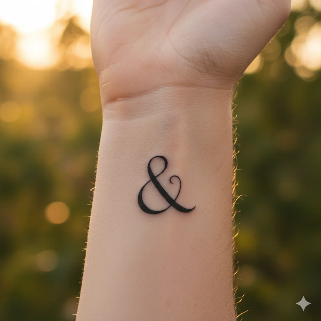
💍 The Ampersand in Tattoos and Jewelry
As a tattoo or jewelry design, the ampersand is minimal yet meaningful.
People often choose it to symbolize relationships, open-ended stories, or self-growth.
It says: “My story isn’t finished.”
It reminds the wearer that life always connects — experiences, emotions, people — all part of one ongoing narrative.
Design-wise, it’s timeless. Whether bold or cursive, small or ornate, the ampersand holds elegance and purpose, making it a popular emblem of continuity and love.
🌍 The Ampersand’s Role in Design Philosophy
In graphic design, the ampersand symbolizes balance between form and function.
It challenges designers to merge beauty with practicality — the very essence of good design.
Because it’s both letter and art, it naturally represents unity in duality. It’s one of those symbols that can define a visual identity while remaining deeply personal.
Whether it appears in minimal branding or luxury logos, its essence remains: connection and flow. That harmony is what gives the ampersand its timeless, global appeal.
🌙 The Emotional Message of the Ampersand
Ultimately, the ampersand reminds us that we are connected — to people, to art, to purpose.
It’s a visual whisper that life isn’t a list of separations but a web of “ands.”
It unites where language divides. It flows where sentences end.
It says everything without needing a single word.
That’s why, even in an age of algorithms, the ampersand remains perfectly human — elegant, emotional, and endlessly relevant.
❓ FAQs About the Ampersand Symbol
1. What does the ampersand symbol mean?
It represents “and” — symbolizing connection, unity, and balance between elements.
2. Where did the ampersand originate?
It comes from the Latin word et meaning “and.” The letters E and T were merged into a single design in ancient Rome.
3. Why is it called an ampersand?
The name comes from “and per se and,” a phrase used when reciting the alphabet centuries ago.
4. What does the ampersand tattoo mean?
It symbolizes ongoing connection, open-ended stories, or relationships that continue beyond time.
5. Is the ampersand used in all languages?
While primarily used in English and Latin-based scripts, it’s recognized globally as a visual shorthand for connection.
6. Why do brands use the ampersand?
It signifies partnership and equality between names or entities, making it ideal for collaborative brand identities.
7. Is the ampersand still grammatically correct?
Yes, but it’s mostly used in logos, titles, and informal writing rather than standard academic or legal text.
William Blake is a poet, painter, and mystic whose visionary works merged art and spirituality. His deep symbolism, rooted in imagination and divine inspiration, continues to inspire seekers of truth. Blake believed that every symbol is a doorway to higher understanding and inner awakening.